I've picked Jon Foreman for my portrait project, as he has been a role model of mine since junior high.
WORD LIST
Jon Foreman
Switchfoot | Charity | Bro-am | Habitat for Humanity | The Beautiful Letdown | Spring, Summer, Fall, Winter | Tim Foreman (brother) | Rock | Alternative | Led Zeppelin (biggest influence) | Christian | God as the only rational reason for living | Vice Verses | Hello Hurricane | Hurricane Katrina relief | John M. Perkins | The Legend of Chin | Garage band | New Way to be Human | Learning to Breathe | Oh! Gravity | Nothing is Sound | Fading West | Surfing | Real, open, honest | Deep thinker | Fedora | Skinny ties | Skater/surfer style (cali, casual) | Long hair (formerly skater hair XP) | Blond | Very unique voice | Deep concern for humanity | Living out the words | Goofy-footed (switchfoot. Surfing term), doing things
differently | Beaches, traveling, tours | Friends of the Foot, friendliness with fans | Podcast, just being silly and real | Big, powerful concerts | Small, personable performances | Smashing guitars XD | Screaming, but the good kind
“writing about ‘fireflies in a graveyard at sunset’”
“sunshine won’t you be my mother, sunshine come and help me
see, my heart is darker than these oceans, my heart is frozen underneath”
“Oh! Gravity, why can’t we seem to keep it together?”
“this is a song about getting that fire back.”
(line break because long post. go to full post for progress reports)
// 03 October 2013 //
CONCEPTS
album covers
One of my initial thoughts has been just to do the portrait in the style of one or more of the Switchfoot album covers. Specifically Nothing is Sound for this one, which isn't very detailed anyways because I'm not sure I want to follow through with it. Nevertheless, their covers have a wide variety to choose from:
four seasons
Limbs and Branches theme, focusing on his work as a songwriter, some of the deeper, more personal stuff. Lyrics for hair. . . I think instead of sticking a tree in each corner, I'd use one tree in the background, divided into sections that are all undergoing different seasons. Seems more appropriate. I might texture his face like a sketch? I'm not sure. I definitely want his face to be recognizable, so I'm hesitant to do anything major with it.
charity
I've thought a bit about doing something revolving around his work with charity/philanthropy. Jon Foreman and the rest of Switchfoot are all very involved in charity, from Habitat for Humanity to organizations for at-risk teens to environmental foundations to Hurricane Katrina relief, which was what inspired the album
Hello Hurricane (which I personally consider their best work). I'm really hesitant about this, however, because I'm not really sure how to handle images related to charity and such without it being hackneyed, forced, and fake. <.<
surfing
Surfing is something Switchfoot does. The very name of the band is a surfing term. I toyed with this one, but when it comes down to it, it's not exactly the primary thing that stands out about Jon Foreman. It's an interesting facet, not a great description of who he is.
led zeppelin
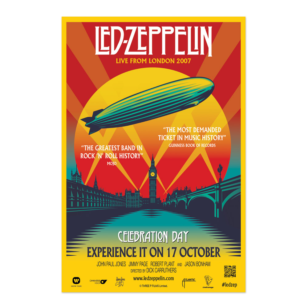
Jon Foreman has been known to credit Led Zeppelin as one of the strongest inspirations for Switchfoot. He and the band are all huge Zep fans, and the style is definitely a huge part of their music. I think it might be kind of fun to do a portrait in the style of one of the Zep posters. If I could pull it off. . . <.<
lyrics
Not a very clever or original idea, but Jon Foreman is one of those people who really lives out the songs he sings. It would kind of make sense to do a portrait of him made of his lyrics.
switchfoot
The term, not the band. "Switchfoot" is a surfing term, basically equivalent to "goofy" in skateboarding. Right foot leading, where left foot leading is the norm. It's about going the alternative way, doing something different. It's more a thematic concept, though. I'm not sure how I would convey this.
on fire
Going to go into a couple of specific songs that mean a lot to me. One of them is "On Fire," a song about getting back the fire and passion of one's youth. You get old, you get tired, you give up on your dreams, you stop fighting and start settling. "On Fire" is a call to stand up again. It was one of the most influential songs of my teenage years, one of the reasons I stayed alive. A fire-themed portrait with the lyrics to this song would be pretty powerful.
the shadow proves the sunshine
First of all, the title of this makes it pretty clear that this would be a good excuse to play with light and shadow. Always a good thing. "The Shadow Proves The Sunshine" is the song that gave me a place to go when I felt isolated and alienated from even my family. 'Dem angsty teenage years. It's a gorgeous song and it's still very near and dear to my heart.
your love is a song
This would definitely be a more lyric-focused portrait, possibly with musical notes involved. Quite likely a portrait where the defining features would be all the face I included. This sort of thing:
This way, the self flows out into the music. The music is what takes over.
this is home
Narnia. Enough said.
In all seriousness, though, Switchfoot did this gorgeous song for Prince Caspian that defined my relationship with God. I've never quite gotten over it. Incorporating Jon Foreman into a Narnian theme? Do I need a reason?
bullet soul
is an odd song.
When Hello Hurricane first came out, this was that one jarring song on the record I just didn't like. It didn't speak to me like the others did. I'd often skip it when listening through the album. The only reason I ever did listen to it was because I'm a diehard about Switchfoot and felt like an unloyal fan if I didn't listen to it.
A year later, the song had become one of my favourite songs in their entire body of work. I got used to grungier sounds, but more importantly, I began to really listen to the lyrics. I grew up a little. I got a little rough around the edges, and then I came back and understood what I hadn't when I was still wide-eyed and clueless about the world.
I guess you could say it's kind of important to me. It's a song about dialing everything up to 11. Being the artists, being the bleeding hearts, being the passionate ones, being the ones who would inhale fire just to feel alive. At least, that's what it means to me. It's the call to follow my passions, even if it seems a little late.
A portrait revolving around "Bullet Soul" would be one of those literal visualizations of the songs they are tied to. Images of bullets, bleeding hears, spark(plug)s, hearts, scars, dials to turn up, things like that. Visualizations.
Actually, kind of similar to the style of the "Oh! Gravity" cover (above, with all the other cover art), though color vs. b/w is still something to consider. . .